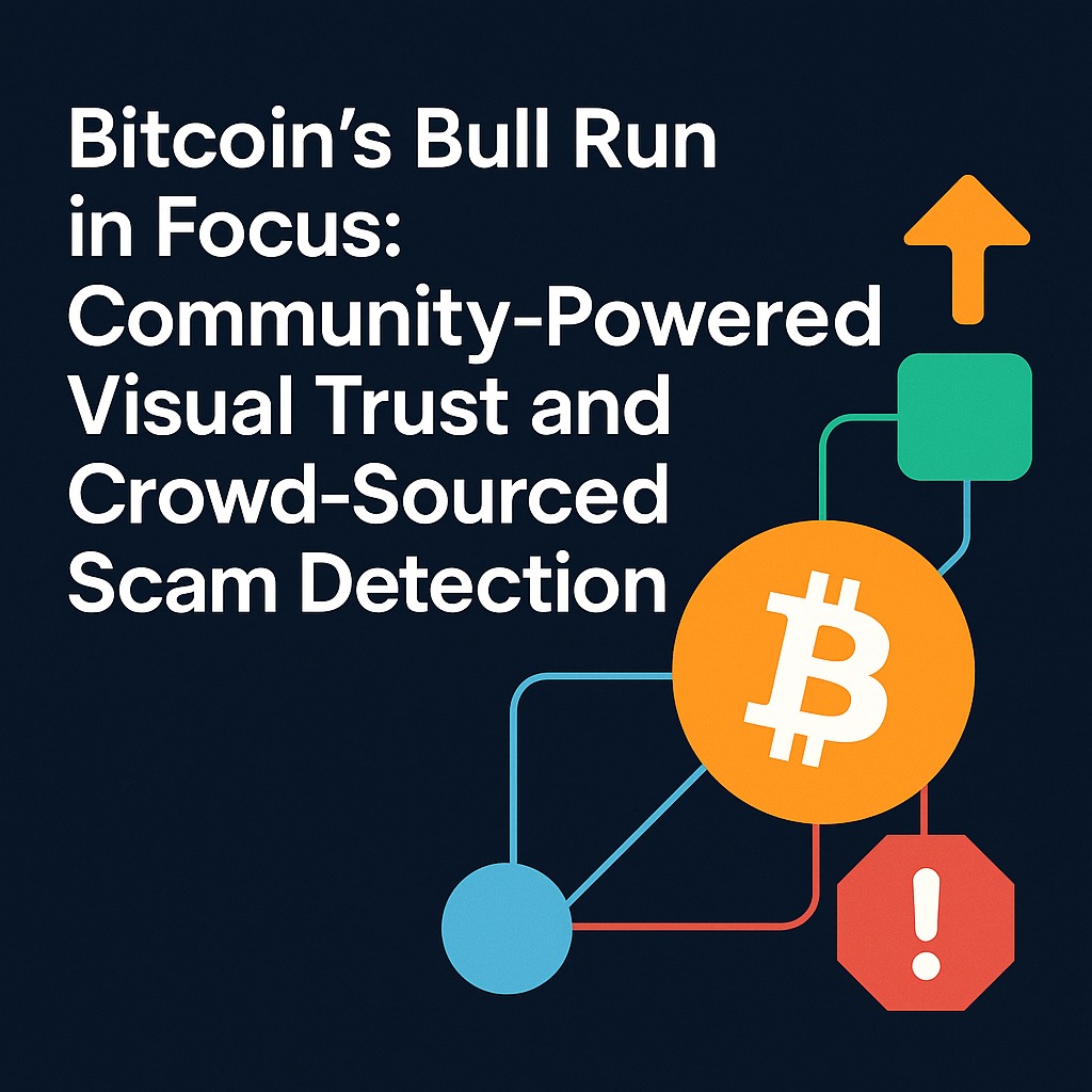
Bitcoin’s September 2025 surge made one thing clear: reading only price charts leaves most of the story hidden inside the bitcoin network’s underlying data. Visual analysis of wallet addresses, individual transactions, and on-chain flows gives traders a clearer view of why the move happened—and how to react safely—than traditional charts alone.hindsight+2
Why September’s move was hard to read from charts alone
Through September 2025, bitcoin’s price chopped, spiked toward new highs, and absorbed a large number of liquidations, all while headlines focused on ETFs, macro tension, and “market resilience.” Standard candlesticks and technical indicators showed volatility, but they did not explain where individual transactions were coming from, how digital assets flowed between wallet addresses, or whether artificial network stress was building under the surface.aurpay+2
Traditional block visualizations and basic blockchain analysis tools show individual blocks, but not how those blocks chain together into behavior—who is buying, who is exiting, and whether money laundering activity or other crypto transactions from risky clusters are quietly riding the move. Without a better lens, traders were left guessing whether the surge was sustainable or just fuel for a deeper correction.vtrader+3
What a visual-first view of the bitcoin network reveals
Visual analysis treats the bitcoin network as a living map rather than a scrolling ledger. On a typical Hindsight-style view, each transaction node is a point on a graph visualizer; wallet addresses appear as circles, sized by balance or activity; exchanges and institutional hubs show up as distinct shapes, and transfers between them form transaction graphs over a timeline visualization.hindsight+2
During September’s surge, a visual overlay of bitcoin transaction visualization made several dynamics easier to read at a glance:lang.solanacompass+1
- Large clusters of new transaction flows from long-dormant addresses into exchanges signaled profit-taking as price ran toward all-time highs.aurpay+1
- Flows from stablecoin-heavy wallets and certain financial institutions into bitcoin-linked addresses showed rotation into BTC as a perceived “safer” digital asset amid volatility.hindsight+1
- Two anomalous transactions—massive transfers through thin-liquidity venues—stood out as potential sources of artificial network stress that price charts alone did not highlight.lang.solanacompass+1
Because the view ties individual blocks into meaningful systemic visualization tools, traders can distinguish organic demand from short-lived spikes driven by a small number of aggressive players.hindsight+1
Why this matters for safety, not just alpha
Visualizing crypto transactions is not only about spotting entries; it also supports effective cryptocurrency data analysis for risk, compliance, and anti-money laundering awareness. Blockchain intelligence platforms and big data visualization tools already help compliance teams and financial regulators trace selected source transactions and off-chain intelligence to specific wallet addresses.hindsight+2
For traders, similar visualization capabilities help answer questions like:hindsight+1
- “Is this surge mostly driven by clean capital, or are known high-risk clusters and sanctions-exposed addresses active?”
- “Are exchange inflows rising from diverse sources, or concentrated in a small number of wallets that could reverse quickly?”
- “Do we see small-scale visualization hints—like repeated flows from the same risky clusters—that price is not reflecting yet?”
Seeing these patterns as visuals, not logs, gives both individuals and institutions a clearer basis for risk management decisions during fast moves.alchemy+1
How Lighthouse turns visual insight into live protection
Visual overlays on a big screen—or even hand-held tablet displays—are powerful, but they still rely on you watching at the right time. Lighthouse exists to sit on top of these blockchain visualization tools and watch the bitcoin network (and other chains) for you, turning visual trust into real-time alerts.hindsight+2
For a surge like September 2025, Lighthouse can:hindsight+1
- Monitor your own wallet addresses for inbound or outbound flows tied to high-risk clusters, ransomware attack histories, or money laundering activity identified by blockchain intelligence platforms.
- Trigger alerts when new transaction spikes through a small set of transaction nodes suggest abnormal behavior, even if price still looks stable.
- Combine price moves with on-chain anomaly detection (for example, large flows into exchanges plus thin order books) so alerts fire only when both technical and on-chain risk conditions align.
For this tactical post, use clear, trader-focused CTAs at the key moments:
- After the main bitcoin analysis section: “Get Bitcoin alerts with Lighthouse—let it watch on-chain flows while you watch the chart.” → **https://hindsight.vip/pricing**.hindsight+1
- At the end: “If you traded September’s surge by feel, trade the next one with facts. Turn on Lighthouse alerts and pair them with your visual analysis.” → **https://hindsight.vip/pricing**.hindsight+1
Connecting this spike to the bigger visual trust story
Finally, this timely spoke should not stand alone. Link it into the broader visual trust narrative so readers understand that what worked for one month in bitcoin applies to the whole crypto stack.hindsight+2Visuakl-trust-HVIP_visual_trust_TWO_HUB_complete.csv
- Early or mid-article, add:
- “If you want to see how visual trust applies beyond bitcoin—across DeFi, NFTs, and exchanges—start with our Pillar 2A hub The Crypto Fraud Crisis: Why It Matters and How Visual Trust Solves It.” → **https://hindsight.vip/blog/the-crypto-fraud-crisis-why-it-matters-and-how-visual-trust-solves-it**.hindsight+1
By combining visual analysis of the bitcoin network, meaningful systemic visualization tools, and Lighthouse alerts, traders can move from reacting to candles after the fact to reading flows, spotting stress, and protecting positions while a move is still unfolding.hindsight+1