Visual crypto analysis gives traders a way to see what is really happening in cryptocurrency markets without decoding code, charts, or arcane metrics. When paired with Lighthouse real-time alerts, it becomes a practical system for better risk management, safer investment decisions, and more confident cryptocurrency trading across digital assets.
[[Horizontal Rule]]
Why traders need visual crypto analysis
Cryptocurrency markets move faster than almost any other asset class, and every second generates more on-chain data, social media memes, and price updates than a single trader can reasonably track. Traditional tools focus on technical indicators, candlestick charts, and raw on-chain data; they assume advanced skills in automated technical analysis or algorithmic trading insights that many users do not have.
Visual crypto analysis tackles this data overload by turning complex crypto transactions into visual financial data that shows flows, risk, and behavior at a glance. Instead of reading through transaction graphs or spreadsheets, traders see a live crypto heatmap of wallets, contracts, and exchanges—helping them spot behavioral patterns, cryptocurrency exchange patterns, and exciting trading opportunities without losing themselves in noise.
For broader fraud context and why visual trust matters beyond trading, this post should link early to the hub The Crypto Fraud Crisis: Why It Matters and How Visual Trust Solves It.
[[Horizontal Rule]]
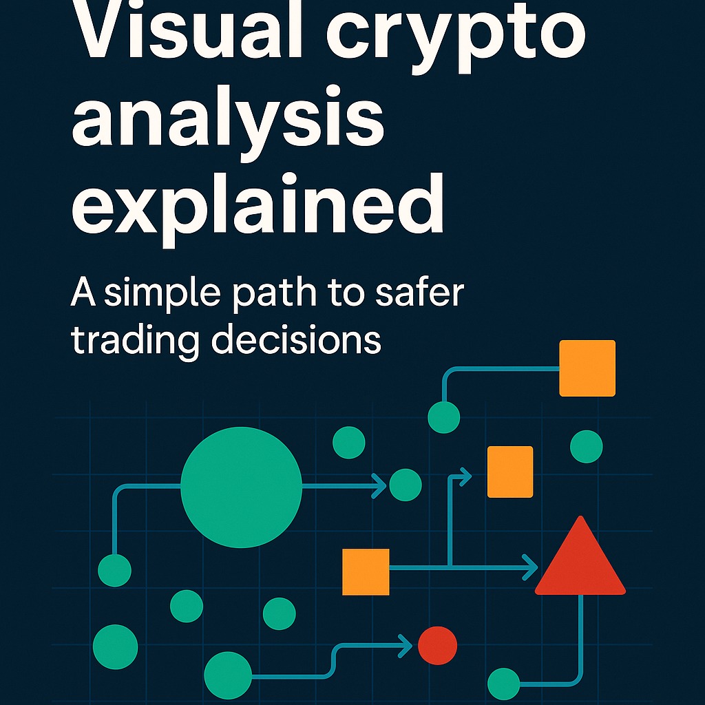
What visual crypto analysis actually shows you
Visual crypto analysis sits on top of blockchain visualization tools and blockchain intelligence platforms to convert on-chain data into a visual representation:
- Circles for wallet addresses (size reflecting balance, activity, or influence across digital assets).
- Squares for smart contracts (DeFi protocols, NFT marketplaces, automated trading apps).
- Triangles for exchanges and major liquidity hubs where transfers tend to converge.
- Arrows to represent crypto transactions and transfers between blockchain addresses in real time.
- Colors to signal risk levels—green for normal or verified flows, orange for caution, red where anomaly detection suggests possible scams, hacks, or illicit financial activity.
Under the hood, these views pull from on-chain data and, in some cases, off-chain intelligence (for example, labeling known ransomware attack wallets or wallets linked to famous cases like WannaCry analysis) to make bitcoin transaction visualization and multi-chain monitoring intuitive. Instead of trying to interpret every technical indicator, traders see visual financial data that highlights what matters: who is moving value, where it is going, and what might be risky.
[[Horizontal Rule]]
How this helps real trading decisions
For traders, visual crypto analysis is less about pretty charts and more about generating clearer trading signal generation and better risk management. Practical benefits include:
- Faster situational awareness: A market heatmap or live crypto heatmap shows concentrated buying, selling, or sudden flows into or out of specific tokens or exchanges.
- Behavior-driven insights: Instead of just price, traders see behavioral patterns—whale accumulations, distribution phases, or panic exits—through changes in node size and transaction graphs.
- Context for technical indicators: Technical indicators still matter, but visual blockchain analytics explains why a pattern is forming by showing where on-chain activity is driving moves.
- Improved risk calls: When a visual cluster begins lighting up red due to anomaly detection or flags from blockchain intelligence platforms, traders can step back before committing more capital.
Effective cryptocurrency data analysis comes from combining these visuals with whatever strategy a trader already uses, not replacing it.
[[Horizontal Rule]]
Where Lighthouse fits into trader workflows
Visual crypto analysis tells you what is happening; Lighthouse tells you when you need to act. Instead of manually babysitting dashboards, traders can use Lighthouse as an always-on alert layer that turns visual trust into practical risk management.
Lighthouse can:
- Monitor key wallet addresses and DeFi contracts for suspicious flows linked to crypto crime or sudden risk spikes.
- Alert when your trading wallets interact with addresses flagged for ransomware attack histories, illicit funds, or sanctions evasion.
- Notify you when whale wallets accumulate or dump a position you care about, turning visual cues into timely alerts.
For traders reading this spoke, you can place direct calls to action like:
- “Make safer trading decisions with Lighthouse—start your free visual alerts trial.” → **https://hindsight.vip/pricing**.
- “Use visual crypto analysis to understand flows, and Lighthouse to never miss critical signals while you sleep.” → https://hindsight.vip for the main product and Lighthouse overview.
[[Horizontal Rule]]
Visual crypto analysis in real scenarios
Several trading and safety scenarios highlight the value of blockchain visual analytics and a graph visualizer view:
- Spotting scam flows: A cluster of small, unfamiliar wallet addresses suddenly sending tokens into one red-labeled contract can hint at a rug pull or phishing campaign.
- Whale watching with context: Instead of just seeing “whale bought,” traders see where that whale came from (exchange vs. cold wallet), how often they trade, and how their moves fit broader cryptocurrency exchange patterns.
- Tracing stolen funds: When funds move post-attack, bitcoin transaction visualization and multi-chain transaction graphs show how attackers try to break link analysis, while visual tools keep the story coherent.
- Compliance-aware trading: Financial institutions and compliance teams can watch their own on-chain activity alongside customers’ flows to reduce anti-money laundering risk without sifting through raw logs.
These examples underline a simple point: visuals shrink the gap between raw data and valuable insights so traders can focus on investment decisions instead of log parsing.
[[Horizontal Rule]]
Making visual analysis inclusive and future-ready
Visual crypto analysis is also about who gets to participate in cryptocurrency trading safely. A user-centric visualization approach helps:
- New traders who are overwhelmed by technical indicators and jargon.
- Neurodivergent users who find patterns in visual representation easier to process than long text or dense data tables.
- Educators and community leaders who want to teach crypto using blockchain visualization tools, not just social media images and social media memes.
As blockchain visualization tools evolve, they will increasingly integrate modern computer vision techniques and algorithmic trading insights, turning raw screenshots and visual financial data into structured signals. Blockchain intelligence platforms are already experimenting with combining behavior-based analytics and computer vision over transaction graphs, market heatmaps, and even social media images to improve trading signal generation.
For traders who want a foundation in visual trust before diving into this spoke, link back to the hub: The Crypto Fraud Crisis: Why It Matters and How Visual Trust Solves It.
[[Horizontal Rule]]
What to do next with Lighthouse and the hub
This post should end by turning understanding into action. A recommended closing structure:
- Invite readers to the hub:
- “If you want the bigger picture on scams and visual trust, start with the fraud prevention hub and see how visual tools protect all kinds of digital assets, not just trades.” → **https://hindsight.vip/blog/the-crypto-fraud-crisis-why-it-matters-and-how-visual-trust-solves-it**.
- Push Lighthouse as the trading safety layer:
- “Then, connect what you have learned directly to your own portfolio. Use visual crypto analysis to understand flows, and let Lighthouse handle continuous anomaly detection on your wallets and favorite markets.”
- CTA button: “Make safer trading decisions with Lighthouse—try visual alerts free.” → **https://hindsight.vip/pricing**.
By combining a visual analytics platform, blockchain visual analytics, and Lighthouse alerts, traders can move from confusion and fear toward a workflow where clarity, trust, and safer execution are built in—no matter how fast cryptocurrency markets move.